Mkt-Viper Edge🔶 Overview
The Mkt-Viper Edge is a specialized market architecture engine designed to map key levels and display the liquidity framework of any asset. It focuses exclusively on Institutional Order Flow and Market Structure analysis to identify high-probability reversal and continuation zones.
Markets do not move randomly; they move from liquidity to liquidity. This indicator automates the complex task of identifying where "Smart Money" has positioned itself. It acts as an X-Ray for your chart—revealing Order Blocks, Fair Value Gaps, Key Support and Resistance levels and Volume areas that are invisible to the naked eye. By visualizing the imbalance between buyers and sellers (Delta) and mapping the breaking points of market structure (BoS/CHoCH), Viper Edge provides the precise "Where" and "Why" behind price movement.
🔶 What makes Mkt-Viper Edge unique?
The Mkt-Viper Edge distinguishes itself by bridging the gap between Price Structure and Institutional Volume. While standard indicators blindly plot pivots and levels based on price alone, Mkt-Viper Edge verifies multiple structural elements against the underlying order flow.
Its Money Flow Matrix engine moves beyond simple "Volume Profiles" by analyzing intra-candle "Wick Pressure." This allows the system to decode the true buying vs. selling intent hidden inside every candle, rather than just aggregating raw data. By cross-referencing this volume data against Key Levels, Order Blocks, and Fair Value Gaps, the system filters out "fake" structure to reveal the high-probability zones where Smart Money is actually active.
Main Features
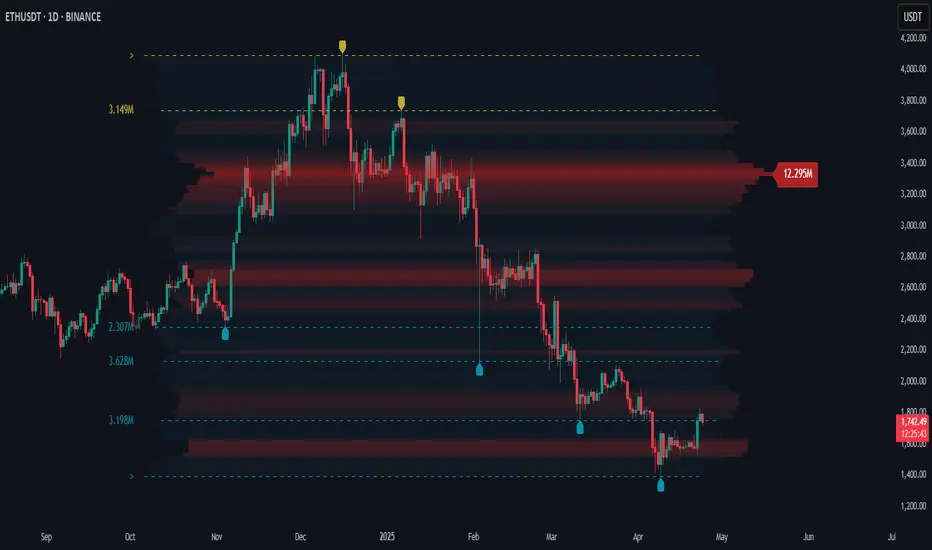
🔶 Viper Money Flow Matrix
The centerpiece of the system is the Matrix—a next-generation Volume Profile and Liquidity scanner. Instead of simply showing how much volume occurred at a price, the Matrix breaks down the intent of that volume.
The Logic:
The engine scans historical price action (customizable lookback) and categorizes volume into Buying Pressure and Selling Pressure based on "Wick Polarity" logic. It then projects this data as a dashboard on the right side of your chart.
Visuals:
The Wings: The bars extending Left and Right represent the "Delta" (Net Difference) and "Total Liquidity."
Value Area (VA):
The High and Low lines indicate the zone where 70% (Institutional Standard) of the trading activity occurred. Breakouts from this zone can potentially lead to explosive moves.
POC (Point of Control):
The price level with the highest volume node acts as a massive magnet for price.
VWAP: An optional "Anchor VWAP" provides a rolling benchmark for fair value (Daily/Weekly/Monthly).
🔶 Ranked Market Structure (MS)
Understanding the "Bias" is the first step in any trade. The Ranked Market Structure module automates the mapping of Trend Structure using Swing Pivots and ranks them based on how strong the break was.
Features:
External Structure:
Detects major BoS (Break of Structure) and CHoCH (Change of Character) events to define the macro trend.
Internal Structure: (Optional)
Highlights micro-breaks for scalpers looking for entries within the larger leg.
Breakout Grading:
Not all structural breaks are equal. The system automatically grades the "Quality" of every break using a traffic-light system (Green/Yellow/Red circles).
Green:
Indicates a high-momentum, impulsive break (Strong Displacement).
Red:
Indicates a weak break where price barely closed past the level, suggesting a potential lack of follow-through.
🔶 Institutional Order Blocks (OB)
Order Blocks represent footprints where institutions have initiated large positions. This module automatically detects these zones and equips them with a deep-dive data suite, allowing you to validate the conviction behind every level.
Zone Analytics (Volume & Delta):
Every Order Block is generated with an embedded data readout. The system analyzes the specific candle that created the zone and displays:
Total Liquidity:
Displays the absolute volume count (e.g., 2.5M) executed during the zone's creation.
Relative Dominance (%):
Shows the significance of this zone compared to all other active Order Blocks on the chart. If a zone shows "50%," it means it holds half of the total volume of all currently displayed structures, helping you identify the most dominant level.
Net Delta:
A numerical display of the net volume imbalance (e.g., Δ +50K), revealing exactly how aggressive the buyers or sellers were.
Volume Bars:
Visual bars on the edge of the zone showing the exact ratio of Buying vs. Selling pressure.
Strength Grading (S/W):
Not all Order Blocks are created equal. The system automatically grades the quality of every zone by comparing its formation volume against the historical average.
Strong (S):
Marked when the zone was formed on significant volume expansion, indicating high institutional participation.
Weak (W):
Marked when the zone formed on low or declining volume, suggesting less reliability.
Usage:
These zones can potentially be high-probability reversal points. When price returns to a Bullish OB (Green), it is a prime location to look for Long entries.
🔶 Fair Value Gaps (FVG)
Price moves aggressively when liquidity is one-sided, leaving behind "Inefficiencies" or Gaps. The FVG module highlights these specific pockets of imbalance.
The Logic:
The system scans for three-candle patterns where the wicks do not overlap. It draws a zone extending forward until price fills the gap.
Mitigation Tracking:
The engine actively monitors the "Health" of the gap. Specifically, it tracks the 50% (Consequent Encroachment) level. Once price closes beyond the 50% mark of the gap, the zone is considered "Mitigated" and is automatically removed to keep your chart clean.
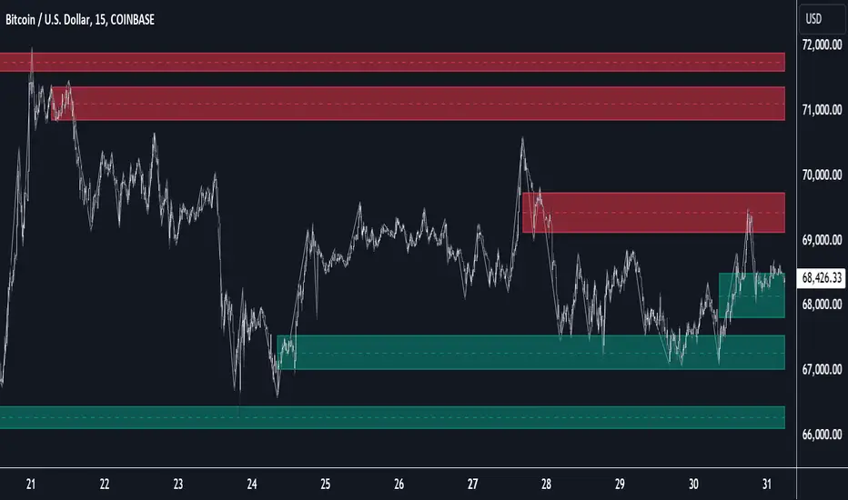
🔶 Smart Support & Resistance Grid
The Mkt-Viper Edge utilizes a dynamic Support & Resistance engine that evolves in real-time as price action unfolds. Instead of cluttering the chart with every minor turning point, this system builds a high-fidelity grid based on interaction frequency and volume intensity.
Volume-Validated Levels:
The engine includes a built-in Volume Filter that ignores weak structure. A level is only projected if the pivot point was formed with sufficient volume relative to the moving average. This automatically filters out low-conviction "noise" pivots, leaving only the structural levels where real money changed hands.
Dynamic Adaptability:
The grid is not a static drawing; it is a living ecosystem. As price tests and reacts to specific levels, the system updates the grid to reflect the most current market reality, ensuring you are always trading against relevant structure rather than stale data.
Wick Precision:
Users can customize the drawing logic, choosing between "Average Center" (for broad zones) or "Wick Precision" (snapping lines to the exact Highs/Lows) for pinpoint bounce trading.
⚠️ Technical Disclosure: Dynamic Object Regeneration
To ensure the grid remains relevant to the current price action, this module utilizes "Functional Repainting." As new pivot highs and lows are formed and confirmed, the indicator effectively "re-draws" the grid to prioritize the most recent and significant structures. Old or invalidated levels are automatically removed to prevent chart clutter.
🔶 Viper Command Dashboard
For traders who need a macro view, the Command Dashboard provides a real-time "Satellite Link" to multiple timeframes (1m to Daily). Select up to 6 different time frames to view data from.
Data Points:
Structure:
Displays the current Bull/Bear status of the Market Structure logic across all TFs.
Money Flow:
Tracks the Money Flow Index (MFI) to show if volume is expanding or contracting.
Viper Band: (Integration)
Displays the trend status relative to the Viper Band from the Mkt-Viper Pro indicator if you are using the full suite.
Forecast:
Based on the alignment of ADX and EMA trends, the dashboard generates a simplified "Forecast" (Pump, Dump, or Consolidation) to help you align with the dominant momentum.
🔶 Visual Intelligence (Theme Engine)
Visual clarity is essential for rapid decision-making. A cluttered or poorly contrasted chart can lead to cognitive fatigue. To address this, Mkt-Viper Edge features a global Color Theme Engine that instantly synchronizes every element of the suite—signals, candles, clouds, and text—to a unified palette.
The Presets:
The system comes with five professionally designed profiles to suit different trading environments and lighting conditions:
Viper Original: High-contrast Neon Green & Purple (Optimized for Dark Mode).
Classic: Standard Green/Red configuration for traditionalists.
Cool Blues: A calming Blue/Violet palette designed to reduce emotional reactivity.
Ember & Ash: High-warmth Orange/Slate contrast.
Monochrome: Grayscale/Silver logic for distraction-free structural analysis.
Customization:
Traders with specific branding requirements or accessibility needs (such as color blindness) can select "Custom Theme." This unlocks distinct color inputs, allowing you to define your own specific Bullish, Bearish, and Neutral colors that instantly propagate across the entire indicator suite
System Integration
Mkt-Viper Edge is designed to function as the "Structure" module within the wider Mkt-Viper ecosystem. While powerful alone, it is calibrated to work seamlessly with Mkt-Viper Pro (Trend Overlay and Viper Oscillator).
🔶 How to use: The "Edge" Workflow
1. Identify the Bias:
Look at the Smart Structure. Are we making Higher Highs (Bullish BoS)? If the Command Dashboard shows Bullish structure on the Higher Timeframes (H1, H4), look for Longs.
2. Find the Interest Level:
Locate an unmitigated Order Block or FVG that aligns with the trend direction.
3. Validate with Volume:
Check the Money Flow Matrix. Is the POC (Point of Control) sitting near your Order Block? High volume nodes act as "Confluence," increasing the probability of a bounce.
4. Execution: Set your entry at the edge of the Order Block or the 50% mark of the FVG.
🔶 Realistic Expectations & Methodology
The Nature of Liquidity:
Viper Edge identifies where orders were placed historically. While price often reacts to these "Memory" zones, market conditions change. A strong news event can blow through an Order Block without pausing.
Lag vs. Structure:
Market Structure (BoS) is inherently reactive—it requires a candle close to confirm. Therefore, structural signals will always appear after the pivot has formed. This is not "lag" in the traditional sense, but the necessary confirmation of a structural shift.
Object Limit (Technical Disclosure):
TradingView places limits on how many drawing objects (Boxes/Lines) can be on a chart. To ensure performance, Viper Edge uses an active "Garbage Collection" system that deletes the oldest levels once the buffer (default 50-100) is full. This is normal behavior to keep your chart fast and responsive.
---------------------
Disclaimer
The content provided in my scripts, indicators, ideas, algorithms, and systems is for educational and informational purposes only. It does not constitute financial advice, investment recommendations, or a solicitation to buy or sell any financial instruments. I will not accept liability for any loss or damage, including without limitation any loss of profit, which may arise directly or indirectly from the use of or reliance on such information.
All investments involve risk, and the past performance of a security, industry, sector, market, financial product, trading strategy, back test, or individual's trading does not guarantee future results or returns. Investors are fully responsible for any investment decisions they make. Such decisions should be based solely on an evaluation of their financial circumstances, investment objectives, risk tolerance, and liquidity needs.
Pine Script®指标